Monday 15 April 2013

Unit 3 Evaluation


For my unit 3 project, I wanted to create a piece of work that I would enjoy working on and wanted to refer to a hobby of mine into my project activities. I like to go ‘train spotting’ and watch the buses at Shrewsbury in my spare time and am interested in other types of transport. I also wanted to relate my project to my hobbies because I am building a railway model, and I like to use authentic pieces to merge with the realistic environment of my fictional layout.
I began with research into liveries and decided to not only focus on the obvious to me, train and buses, but to look further afield to ships, racing cars, trams, taxis and basically all things to do with transport.  My search then went even further afield to even more artistic designs such as those for a fairground, circus and narrow boats. After completing my research, I was advised that maybe there would not be enough content in this particular area to give me enough work for a year long course.
I then decided to look at Travel Posters and so began researching posters from old and compared them to modern examples. I looked at the work of designers such as AM Cassandre, Edward McKnight Kauffer, and Tom Purvis. Whilst researching Edward Kauffer, the name Harry Beck cropped up, as Beck had designed the first easy to use London Underground map, based on a circuit board. Their work was of great interest to me and it was interesting to see the various styles they used. I then went on to look at the work of David Kirk and looked at the artists that influenced him.  I liked his work, though this is surprising really; his work is very simple and lacks great detail. However I think that it appeals to me because the scenes are prominent and almost dreamlike. They have an innocent look to them and are reminiscent of the illustrations you would see in a children’s book. He specialises in beach scenes and cityscape scenes and these remind me of images of the travel posters from past times when they advertised a trip to the coast and holidays away for the family.
My mind made up, I decided I would work towards creating a travel poster. I created a mind map, thumbnail drawing and collected together images of subject matter.   I 
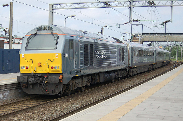
was then able to begin my experiments by using a screenshot of footage taken of my very own model railway. I put this image into Photoshop and started work on taking out the messy background and using the ‘Posterise’ effect to adjust the levels and take away some of the detail in the picture. I experimented with the background colour and some of the other colours and settled on a sky blue for the background and yellow/green for the area around the tracks. I think that I was already seeing my work go in the direction of David Kirk as I was trying to produce a piece of work  that looked simple and not bogged down with too much detail.  Although to really produce work of a similar style, I had to tone down the colours and give my work a more childlike simplicity. As part of my experimentation I produced the picture in black and white, evidence of these experiments can be seen on my blog. I continued my experimentation with further images of trains and buses and using Photoshop as I stripped the image back and tried to present it in a more simplistic form. Looking back through my work I can see that as I progressed with my experimentation, I was finding it easier and easier to produce images in a more simplified way.  I am very particular on fine detail when replicating anything and so this approach to working was very different and sometimes challenging for me.  It was very tempting for me to start adding detail rather than taking it away!  With regard to font type for a poster, my research showed me that the font is always very clear and easy to read, so I looked at different font types that I could possibly use for my poster.  After visiting Powys Castle in Wales I decided to emulate a David Kirk poster.  I chose an image of the castle that I felt had a David Kirk style to it; the castle is situated to the left of the image and there are large conifers in the forefront. The examples of his work on my blog, all appear to show quite a large area of the sky and this is also the case in the photograph I have taken of Powys Castle.  I tried to limit the colour palette to only a few colours as this is a distinguishing feature of the work of David Kirk. I then progressed to vector experimentations by creating an outline of an image which is the outline that I used as a base for future images, this can be noticed in the two experimentations of firstly London Midland, and then ‘Thomson Connect’ trains. After exporting this to a PNG, I then opened it in Adobe Photoshop and began to add the colour and sketched a straight dimensional path to look like a station platform. I was quite pleased with this piece of work however the text choice and text colour looks unprofessional and is something that I thought about more in my final piece. I experimented with a number of posters by changing the colours, view of the train etc. The ‘visit Norwich’ poster  was an idea that I created one evening and I decided that I would simplify further still and play around with perspective. I have created straight lines as I think that this gives the impression of a speeding train shooting off the poster. Again I have used a limited colour palette and given the image a night-time feel. The train livery could almost look like the lights in a train compartment as it speeds along the tracks.
For my final pieces, I decided to create a set of posters that all followed a similar style and theme. I searched the internet and my own photographs for images that I felt I could work with. I followed the limited colour palette for each and the same font was used.  All the images were produced using Photoshop and I have learnt new skills such as creating a colour swatch from an existing image. I am definitely more confident using the iMac and its software and my skills have improved considerably.

Thursday 10 January 2013

Vector Experimentations

I decided to attempt to do a vector image, copying the correct details of the livery from the image below:


Firstly, I copied the outline of the correct train, which is a 170 Turbostar. I used this outline as a base for future designs. Originally, the London Midland livery I painstakingly copied using Adobe Illustrator has a rather crude finish in the far left. I exported to PNG (Portable Network Graphic), which loses the background, leaving just the train vector, and imported the file into Adobe Photoshop. I intentionally missed out the branding on the train, as this train was originally designed for an emulation of the Anglian and Midland Trains timetable.
In Photoshop, I sketched out a straight dimensional path, almost appearing as a platform the other side, and coloured the half of the background the same green as the train. I added the "Travel From" and distorted it to run along the side of the train. The "Shrewsbury to Birmingham" text is actually straight, and coloured the lighter green that can be spotted under the windows of the train. Lastly, I added the price to make it sound like a bargain, and extended the canvas to the bottom. This left a thin transparent strip, which I coloured black, and inserted the London Midland logo.

What I really like about this poster, is the accuracy and the time I took to get every detail of the vector, so people just have to skim an eye over the train, and they know it is London Midland.

What I feel brings the quality of the poster down, is the colour choice of the text by the train, and the unprofessional look of the text, looking like it's just been stuck on the advert. I will take this into account when doing my final piece.


For this poster, I simply changed the colour scheme to 'Thomson Connect' lievery. This consists of metallic red and silver, with special 'disability' yellow bars framing the doors: this technique would warn disabled people where the doors are, and the fact they would be opening at stations. I then opened the train in photoshop again, and used the same typeface as the logo ('Calibri'), using the idea of simplicity, I used the text in normal for the full sentence, and emphasised the destinations in bold. Lastly, I created the 'Thomson Connect' logo in a different file; this consisting of the same font, bold in capitals for 'Thomson' and normal in lower case for 'connect', resized to show a more crisp logo. I simply added this in, with the slogan: 'Faster connections with Thomson Travel' on a same shade of red strip, to show formality. This would enable the viewer to find out in the space of a quick glance that these trains may be going their way.


This poster was more of a plea for help, as this advertises the deceased Wrexham, Shropshire and Marylebone Railway. Firstly, I searched for a significant train; 67014 pulling three old intercity livery coaches.
 
This is significant as this was the train I had originally bought for my layout. The name of this locomotive is 'Thomas Telford', which might not be very easily made out. I originally copied this train, with black outline. When I realised black outline was very dominant, in my attempt to take it out, I found out the whole copy was flawed. So I replaced the black with white. I then opened the image in photoshop, and added white to black gradient from left to right. Having done this, I saved this as a jpeg, and opened it again in photoshop, to add the body of the advert. I used the simple WWII idea of 'We need YOU!' that was used to encourage people to enlist for the army. I then enlarged the 'You' to hopefully appeal to the audience, that this advert wanted them to do something about this. Further down, I used a black and yellow to talk about the great wonders of the WSMR, and used yellow to highlight the key points; comfort, countryside, golden era of rail, fine cuisine, outstanding service. I then used the 'obvious' tactic, stating that the WSMR was this train. Lastly, I explained in a final paragraph why help was needed, and how to help.
I again used the strip at the bottom of the poster, putting a dominant 'The WSMR Campaign' in red.
Also, I used the idea of assuming someone had already done it, putting 'Thank you' in italic, to hopefully encourage them to do so.

This poster is undoubtedly my favourite. A long time ago, I created a dizzying amount of history for Gainsridge, stating the operation went from GBLS (Gaynes Bridge Locomotion Services) through GRL (Gainsridge Railway Limited) to AMGR (Anglian and Midland Gainsridge Railway. Once this was done, I decided to create the logos for this rail companies. For AMGR, I wanted a emblem of Anglian and Midland. I soon settled for Norwich Cathedral, and Ironbridge. I then copied these as silhouettes, and exported to PNG.

One day, I was feeling experimental, and wondered what would happen if I loaded the Norwich Cathedral into a file, and turned it to a canted angle. Curious, I decided to try it, and hit a brainwave. I quickly worked to colour one side of the long straight that had been created on the left with the colours of 'One Anglia Railways', using dominant colours to advertise 'Norwich' and 'train'. Lastly, satisfied with the simplicity of the poster, I added a sky blue to the background, and one other thing I found very quickly through my rail travels and poster research. There are usually the appropiate web addresses somewhere in small on the poster. Unfortunately, I couldn't find out the web address for 'One Anglia Railways' as Abellio have taken over with 'Greater Anglia'. But the address on the right is genuine, and you will soon find yourself on Norwich Cathedral's website if you copied it into the web browser.

Some of the main things I made clear to do with this poster is the idea I created in the head if this was at my station. You would read the 'Norwich' part, get attracted to the colours in the left, and turn around to see the 'One Anglia' livery patiently waiting at a platform. You would immediately realise that is the train to take to visit the legendary cathedral.

(ONE ANGLIA) Livery train